36 More Fonts to Consider When Branding Your Business or Blog
Several months ago I did a post containing 36 different font pairings to help bloggers and business owners brand themselves. I was absolutely floored by the views and feedback I received and it turned out to be one of my highest viewed posts to date. Because of the overwhelmingly positive feedback, I've decided to do a second round of fonts to pair. Please note: you can download all of these fonts for yourself at the bottom of this post.
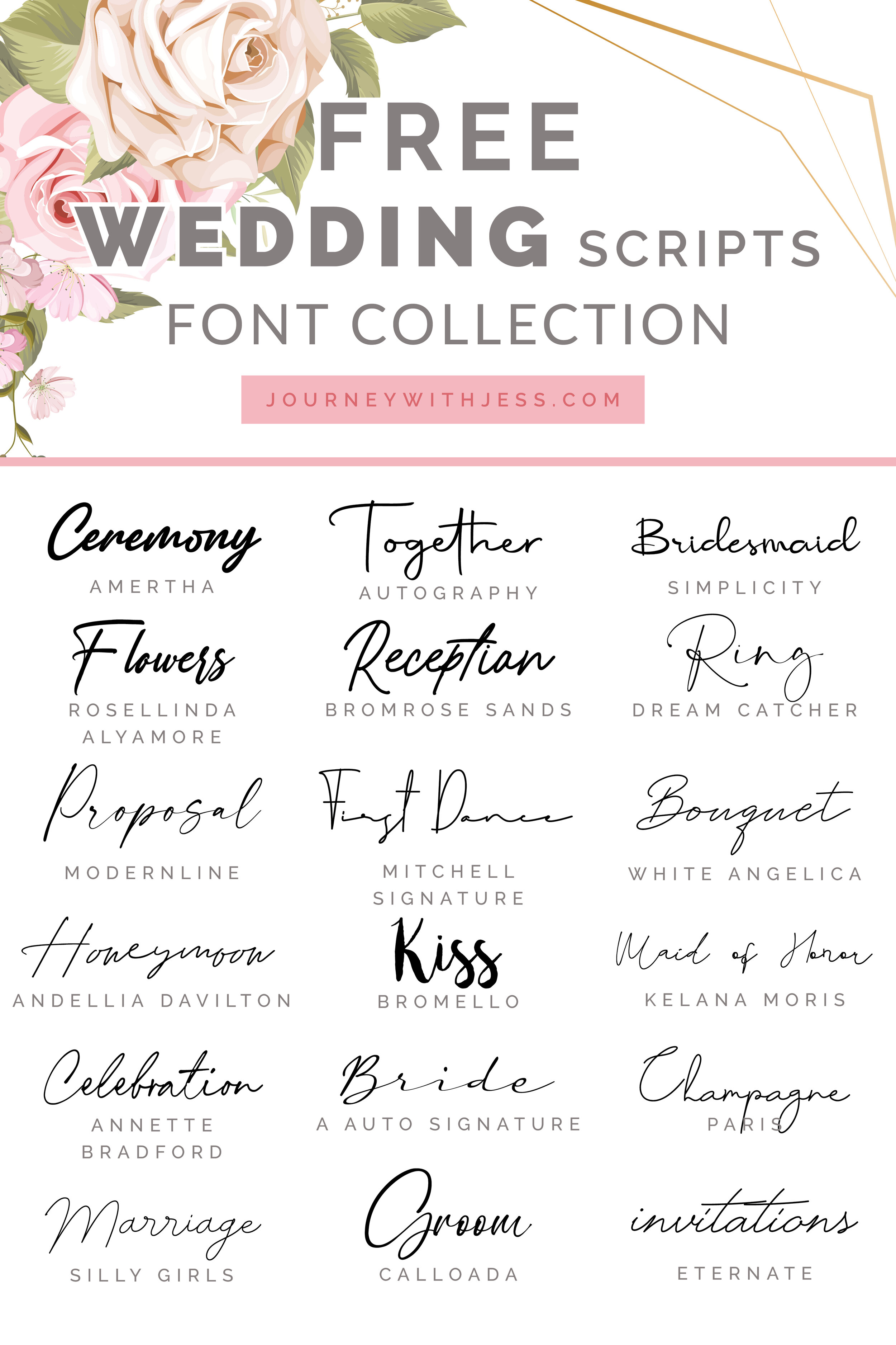
Some of the most popular fonts bloggers use for their image headers contain a script font. Script fonts are great to use if you want to add a bit of depth and variety to your image or even website. If you're a business owner or blogger, creating a strong visual style is the core to a strong brand. You don't need to be a designer to pair fonts together. Even just knowing some of the key terms will help you immensely when it comes to typography and font pairing. and I've put together some of my favorite font pairs and at the bottom of this post you'll find links for each one of these to download yourself. If you're unfamiliar to typefaces, in my examples you'll see a set of larger and smaller fonts. The larger fonts are the header fonts - typically used for short phrases or keywords and the small font is used for sentence structure. There are also some terms that are important to know as well. Below is the break down of some of the most commonly used terms.
TYPOGRAPHY
Typography refers to the arrangement of type in a visually pleasing way. This is achieved by the use of both white space and varying typeface's to visually communicate ideas.

Source: http://typeplate.com/
KERNING
Is the process of adjusting space and distance between two characters in your type. This is typically done in order to achieve more balance and symmetry and helps make your type more visually pleasing.

Source: https://99designs.com/blog/tips/11-kerning-tips/
LEADING
This is the distance between the baseline of type. Not enough space between can cause the text to overlap making the content hard to read, while too much space can cause the content to appear disjointed. It's good to find a happy balance between the two.

Source: https://patriciasdesignsite.wordpress.com/2015/01/16/leading-in-typography/
SERIF TYPEFACE
Is a typeface style that has decorative lines (Serifs) at the end of horizontal and vertical lines. You may be familiar with these fonts if you've ever written a paper for school. Because of these, serif fonts tend to look professional and feel more traditional. Common serif fonts are Times New Roman, Garamond and Georgia.

Source: http://www.mmprint.com/blog/2011/typography-typefaces-serif-sansserif/
SANS SERIF TYPEFACE
Is a typeface style in which there are no decorative lines at the end of each character. These fonts appear more modern and feel cleaner. Common sans serif typefaces include Arial, Helvetica, AvantGarde and Verdana.

Source: http://www.mmprint.com/blog/2011/typography-typefaces-serif-sansserif/
SCRIPT TYPEFACE
Is a typeface style that copies the look of cursive handwriting. Script fonts can appear more classy and elegant or more casual. This is entirely dependent on the amount of embellishment.
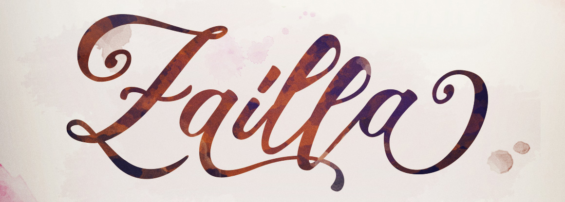
Source: https://fontbundles.net/dirtylinestudio/1649-zailla-script
SLAB SERIF TYPEFACE
Is a typeface style that is thicker and is commonly used in headlines or titles. They appear very bold and strong and are typically not used in long blocks of text.

Source: http://ilovetypography.com/2008/06/20/a-brief-history-of-type-part-5/
Below you can find the list of all 36 font pairings you can download today!
6/7 UPDATE: I've recently been notified that the font Salted Mocha was not available in a .ttf format. I've converted the .otf file to a .ttf file for those of you using Macs.
1) Click on any of the above links.
2) You will be directed to the font webpage.
3) For dafont.com: Click on the "download" button on the right hand side. A zip file should begin downloading. If not located on dafont.com, be sure to follow the instructions listed near the bottom to download. Locate the zip file and open it. Open all of the .ttf files and click the "install" button at the top of each window that opens. They will be automtically installed into your fonts folder.
If you're getting an "invalid font" error, trying logging in as Administrator. Don't drag the files directly from the zip folder in to the fonts folder: this won't work. If you're still having issues installing, please google "invaild font" and you should find some discussion boards.
DOWNLOAD INSTRUCTIONS FOR PC
Disclaimer: Most of these fonts are free for commercial use. Please read the license on each font before using them. The downloaded zip files should contain a text document called "license." It is your responsibility to read the terms and conditions for each font you choose to download. Any font listed as "Demo" means you are allowed to download and try for free. You will need to purchase the license if you decide to use the font past the mock-up phase.