

22 Design Terms Simplified For Non-Designers
Becoming a graphic designer is a lot more difficult than many people think it is. On top of learning all of the design software [which is time consuming and tedious] there is an overabundance of terms that all aspiring designers must know and become familiar with if they want to continue down the path. Not knowing these specific terms can be catastrophic to your reputation in the industry and can call into question your credibility. With so many terms, it can be a little overwhelming - but never fear, I'm here to break down some common terms and explain them in a way that will hopefully make sense to you. The following list are some important terms I feel every designer should know.
1. Alignment
The positioning of elements (text, images, etc) to achieve a more balanced look that makes logical sense. Alignment can be left, right, centered or justified.
2. Bleed
During the printing process a protion of the page will get trimmed off. The bleed is necessary because it ensures the important features of your document won't get cut off. The bleed is the part on the side of a document that gives the printer a small amount of space to account for movement of the paper, and design inconsistencies.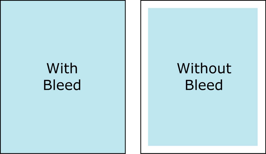
Source: https://graphicdesign.stackexchange.com/questions/55905/how-can-i-determine-how-much-bleed-to-use
3. Pixel
All images are comprised of blocks of tiny pixels. When viewed, this provides a clear and high-quality image. Note: The quality is entirely dependent on both the screen resolution as well as the DPI (Dots per inch).Source: http://www.ultimate-photo-tips.com/what-is-a-pixel.html
4. Layers
This is a tool most design software has and allows you to organize your work. Layers are a tiered system and allow you to work on one layer at a time or you can make groups to work on several at once.
Source: http://www.crhfoto.co.uk/crh/layers_basics/layers_palette_basic.htm
5. Palette
A collection of colors that complement one another and that you plan on implementing in your design.
Source: https://designschool.canva.com/blog/brand-color-palette/
6. CMYK
CMYK is made up of the following: Cyan, Magenta, Yellow, Key. This color mode is used for printing purposes. CMYK is a subtractive color meaning that it starts off as white and as we add color it results in a darker color.
7. RGB
RGB is made up of the following: Red, Green and Blue. This color mode is used for screen purposes. RGB is an additive color meaning that we start off with black and end up white as more color is added.
8. Pantone
Pantone Matching System (PMS) is a system of colors for printing spot colors. Pantone colors are numbered which makes it a lot easier to reference and identify various shades of color.
Source: https://pixabay.com
9. Crop Marks
These marks are located on the outside of the print and are used as guidelines for cutting down to the final size.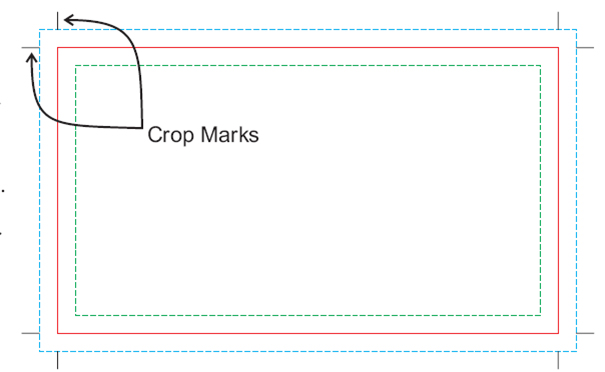
Source: https://alphagraphicslisle.wordpress.com/2011/12/12/need-to-know-printing-terms-bleed-gutter-and-crop-marks/
10. Opacity
The amount of transparency an element has. The lower the opacity, the more transparent it is.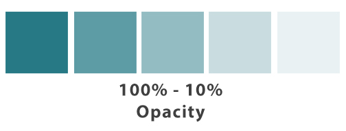
11. Resolution
This refers to how much detail an image has. The rule of thumb is the higher your resolution, the clearer your image. This also measures the dots per inch (DPI) for printed works and pixels per inch (PPI) for digital work. Best practice for this is to stick to at least 300 DPI for anything printed and at least 72 PPI for digital.
12. Raster Image
As mentioned above, all images are made up of individual pixels. Altering the dimensions of a raster image may result in a blurry image since you’re simply shrinking or stretching the pixels themselves.13. Vector Graphics
This refers to an image that is made up of paths and curves (vectors) rather than a grid of pixels. Vector graphics are created through the commands of a mathematical equation. Because of this and the fact that it isn't made up of pixels, gives you the ability to resize it however you like without losing image quality.
Source: https://mlpforums.com/topic/13023-what-is-a-vector-graphic-what-a-vector-graphic-actually-is/
14. Typography
Typography refers to the arrangement of type in a visually pleasing way. This is achieved by the use of both white space and varying typeface's to visually communicate ideas.
Source: http://typeplate.com/
15. Kerning
Is the process of adjusting space and distance between two characters in your type. This is typically done in order to achieve more balance and symmetry and helps make your type more visually pleasing.
Source: https://99designs.com/blog/tips/11-kerning-tips/
16. Leading
This is the distance between the baseline of type. Not enough space between can cause the text to overlap making the content hard to read, while too much space can cause the content to appear disjointed. It's good to find a happy balance between the two.
Source: https://patriciasdesignsite.wordpress.com/2015/01/16/leading-in-typography/
17. Serif Typeface
Is a typeface style that has decorative lines (Serifs) at the end of horizontal and vertical lines. You may be familiar with these fonts if you've ever written a paper for school. Because of these, serif fonts tend to look professional and feel more traditional. Common serif fonts are Times New Roman, Garamond and Georgia.
Source: http://www.mmprint.com/blog/2011/typography-typefaces-serif-sansserif/
18. Sans Serif Typeface
Is a typeface style in which there are no decorative lines at the end of each character. These fonts appear more modern and feel cleaner. Common sans serif typefaces include Arial, Helvetica, AvantGarde and Verdana.
Source: http://www.mmprint.com/blog/2011/typography-typefaces-serif-sansserif/
19. Script Typeface
Is a typeface style that copies the look of cursive handwriting. Script fonts can appear more classy and elegant or more casual. This is entirely dependent on the amount of embellishment.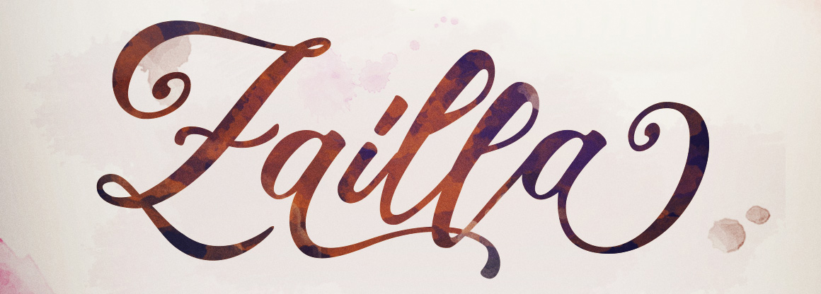
Source: https://fontbundles.net/dirtylinestudio/1649-zailla-script
20. Slab Serif Typeface
Is a typeface style that is thicker and is commonly used in headlines or titles. They appear very bold and strong and are typically not used in long blocks of text.
Source: http://ilovetypography.com/2008/06/20/a-brief-history-of-type-part-5/
21. Margins
This refers to the space around the edge of the document. Margins are important to design because they create white space and contribute to the overall look and feel of the design.
Source: https://codepen.io/andrewgrant/post/css-margin-collapsing-explained
22. White Space
Also known as negative space; this is an important design element and is helps maintain a clean and modern look. White space is a great way to make complicated designs appear less busy and cluttered.
Source: https://pixabay.com

